
Project Overview
Hoopla is a free web and mobile library media streaming service that is accessible with a public library card.
Users are given a limited number of media (books, e-books, movies, music etc.) that they can borrow per month. This number renews at the beginning of every month.
Users are given a limited number of media (books, e-books, movies, music etc.) that they can borrow per month. This number renews at the beginning of every month.
Problem Statement
Finding the number of remaining "borrows" for the month is difficult to find. Users must look at their recent borrows, which is only accessible on the home screen, to see small text that indicates their remaining borrows. This is important information to decide if the user can afford checking out a piece of media.
Assumptions
● An alternative design with a separate user profile section will optimize the amount of interactions needed to find information on the member’s remaining borrow amounts for the month.
● There should be more than one location that houses the member’s borrowing information.
● It is more intuitive to go to a user's profile to find the remaining number of borrows they have for the month.
Methodology
● Comparative Usability Test
● Counterbalanced
● Outcome measure: # of clicks
● Analysis: Paired T-Test
● Post-task survey
Research Design
Experimental Within-Subjects
I conducted an experiment with a total of 14 participants recruited through convenience sampling. Each participant navigates through both designs with randomization of the order that the designs are presented.
Ideal Participant: currently has a library card but has never used Hoopla.
I conducted an experiment with a total of 14 participants recruited through convenience sampling. Each participant navigates through both designs with randomization of the order that the designs are presented.
Ideal Participant: currently has a library card but has never used Hoopla.
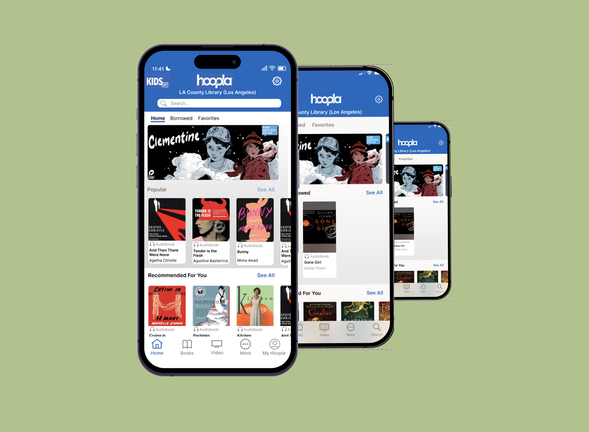
Using Figma, I created high-fidelity interactive prototypes of both Hoopla’s original application design and my alternative design.
Based on my assumptions, I separated the home and user profile.
Participants press “My Hoopla” on the bottom right, which leads them to their account with their borrow information.
Findings
Critical Difference Benchmark: 5
Observed Difference: 4
95% CI (0, 9.43)
Effect Size = 0.75
Observed Difference: 4
95% CI (0, 9.43)
Effect Size = 0.75
(Original) Avg # of Clicks: 6
(Alternative) Avg # of Clicks: 2
43% of participants valued having their relevant information presented to them in one space
65% of participants valued having a separate profile page
Recommendations
Although there was not a significant difference between the designs, that
insignificance in combination with a large effect size indicate that both designs are useful.
insignificance in combination with a large effect size indicate that both designs are useful.
Since both designs are useful, my recommendation is to merge the original and alternative design based on elements that were reported useful to users.
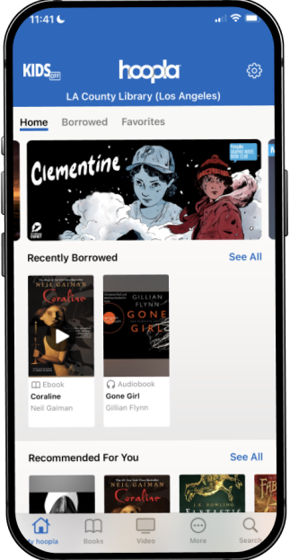
Users can press on their profile to view all information pertaining to their account, favorites, borrowed, previously borrowed, and the remaining number of borrows they have for the month.
In the same design, users can also press on the borrowed tab located at the top of the home screen, which will lead them to the same information. This would allow multiple workflow options for the user to follow when searching for their account information.
Original Design

Recommended Design
Takeaways
This project was my first usability test that I conducted as part of my Usability Design & Testing course at Claremont Graduate University. This experience helped me gain proficiency with Figma, apply my knowledge of statistical analyses, and explore design standards and conventions.
If I were to do this project again, I would consider other key metrics such as the number of errors or time on task instead of just number of clicks. Another potential measure would be UMUX, which is a 4-item usability metric for user experience that measures users' satisfaction with digital experiences. Additionally, I would gather more qualitative data and ask those questions right after each task rather than after both tasks were completed.
Fun fact: I checked the Hoopla app recently and saw the addition of a profile section!
Note. This study is not affiliated with Hoopla.
